OPTAVIA Connect: Enterprise Platform Strategy & Coach Architecture
Designing data-dense operational dashboards and multi-persona alignment workflows for a health enterprise serving 800K+ users.
- Role
- Senior Product Designer
- Timeline
- Feb 2022 – Jun 2025
- Stack
- Dashboard Architecture, Data Visualization, Design Sprints, Enterprise SaaS
## images
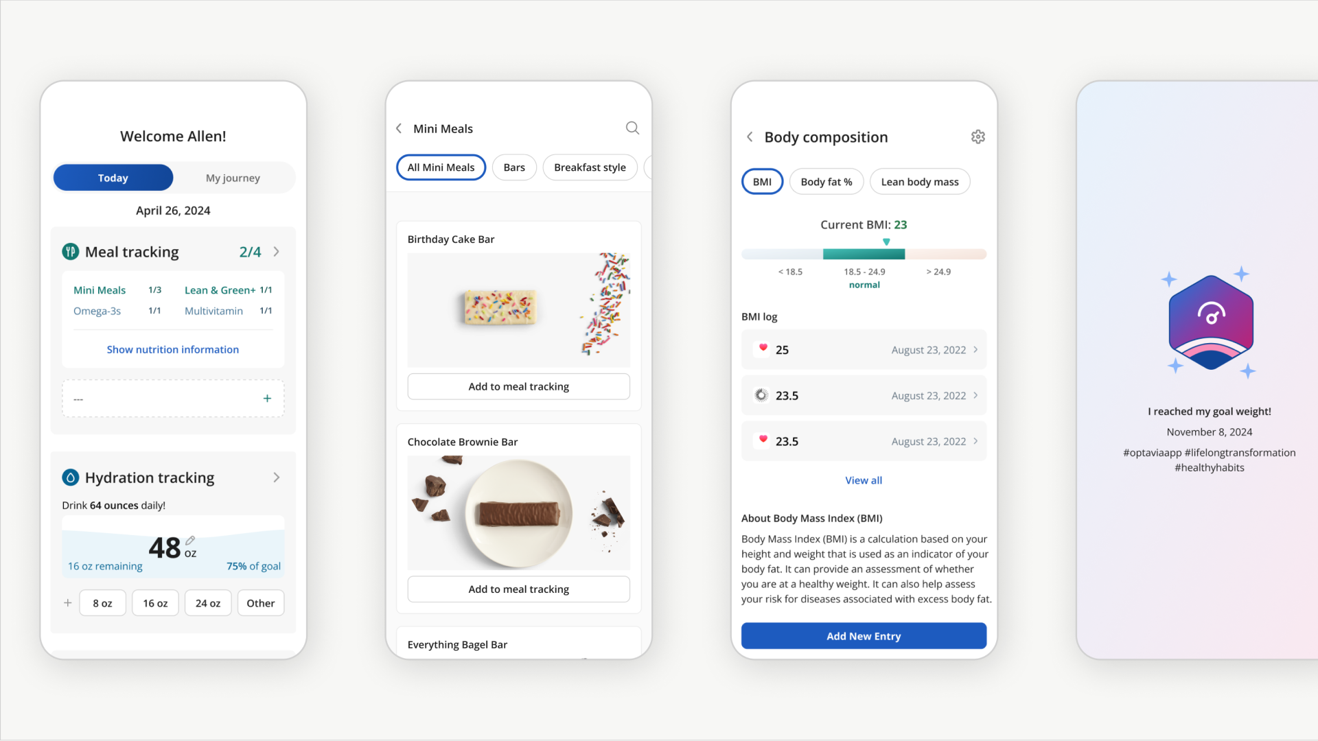
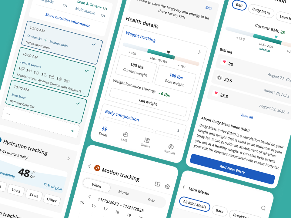
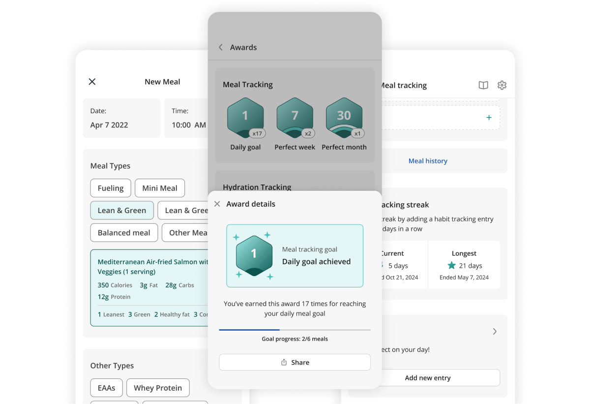
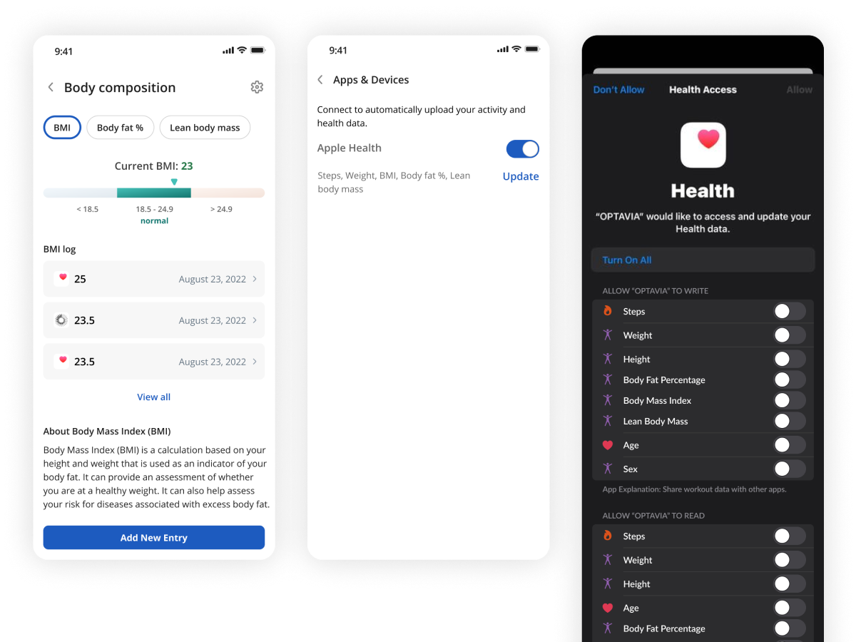
- 800K+ Users
- Platform Reach
- Coaches & Clients
- Core Personas
- Data-Dense Dashboards
- System Scope
The Situation
OPTAVIA operates at an enterprise scale with an integrated health ecosystem pairing direct consumer apps with a distributed network of thousands of independent business coaches. While client-facing tools focused on simple habit tracking, the operational backbone of the business—the independent Coach portal, OPTAVIA Connect—faced a major UX deficit.
Coaches were managing high-volume client pools, complex multi-tier compensation models, tracking Frontline Qualifying Volume (FQV), and auditing compliance data through a legacy interface. The technical debt hindered coach productivity and slowed client retention loops.
As a Senior Product Designer, my objective was to lead the user experience re-architecture of the core Coach experience. I collaborated across a cross-functional matrix of multiple Product Managers, data analysts, and engineering teams to transform dense relational data lines into high-leverage operational workflows—a push that ultimately served as the anchor for my promotion.
System Complexity & Information Architecture
The foundational challenge of the Coach platform was cognitive load. A high-performing coach needs to see real-time team volume spikes, client adherence drops, and compliance flags simultaneously to manage their independent practice.
I mapped and structured dense dashboard interfaces that consolidated multi-dimensional metrics into a clean, hierarchical canvas:
- The Operational Ledger: Designed real-time tracking modules to display complex commission milestones, cascading group volumes, and qualifying points without exposing overwhelming blocks of raw text.
- The Client Support Interface: Engineered a cross-persona workspace that surfaced clear operational triggers—highlighting clients whose ordering cycles fluctuated, tracking milestone goals, and organizing communication cues.
- Compliance Integration workflows: Implemented explicit UI guardrails ensuring that safety guidelines, independent disclosures, and strict health criteria were woven directly into user communication pathways.
Validate Through Design Sprints
To ensure alignment across the engineering stack and independent stakeholder pools, I utilized cross-functional 5-day design sprints:
- Map: Deconstructed the dense, multi-tiered data points of the enterprise compensation structure into logical user priorities.
- Sketch: Generated interface variants focusing on variable-width data tables, interactive forecasting tools, and toggleable detail panes.
- Decide: Navigated engineering limitations alongside database teams to guarantee that real-time calculations would not cause system lag during end-of-month volume spikes.
- Prototype: Built comprehensive high-fidelity interactive prototypes in Figma, testing how rapidly users could execute high-volume management tasks under pressure.
- Test: Validated flows with active independent platform leaders, iterating directly on visual data dense layouts to isolate and remove click-path friction.
Key Takeaways
- Cross-Functional Fluency: Successfully navigated a highly complex, multi-persona enterprise matrix, shipping major features that required strict alignment between distinct backend product teams, data architects, and marketing stakes.
- Data Density Mastery: Proved that complex, numbers-heavy enterprise interfaces do not have to feel cluttered or opaque. Clean visual hierarchy, sensible progressive disclosure, and component alignment can simplify the most convoluted financial and operational data architectures.
- Design System Governance: Authored and integrated component rules directly into the core corporate design system, accelerating cross-platform development velocities and securing a unified UI structure.
[ View System Tokens ]
:root {
  --background: #fafafa;
  --foreground: #232221;
  --muted: #706d68;
  --rule: #e3e0db;
  --surface: #f2f2f2;
}

[data-theme="dark"] {
  --background: #191919;
  --foreground: #e4e4e2;
  --muted: #979693;
  --rule: #2f2f2f;
  --surface: #121212;
}

@theme inline {
  --color-background: var(--background);
  --color-foreground: var(--foreground);
  --color-muted: var(--muted);
  --color-rule: var(--rule);
  --color-surface: var(--surface);
  --font-sans: var(--font-inter), ui-sans-serif, system-ui, -apple-system, "Segoe UI", sans-serif;
  --font-mono: ui-monospace, SFMono-Regular, Menlo, monospace;
}